RIP Home Tab 🪦

Authored by Sindhu Mohan, co-founder @ Snowball
We used to think building Snowball meant adding more features.
But over time, we’ve found that removing features is what actually sharpens the product.This post is about the biggest cut we’ve made so far: deleting the Home tab (the very first screen Snowball was built on) and why simplifying the app has made it clearer, easier, and more true to what Snowball is meant to be.
Most products grow by adding more features. But lately, we’ve been removing them.
The title of this post has already spoiled it. But the point of this blogpost is to share the full context and rationale behind the decision.
So, if you are interested in the behind-the-scenes, I hope you enjoy this read.
Intro
It was painful at first. Throwing away hours (or weeks) of hard work is not fun. The streak bubble row on our old Home tab, for example, took forever to design and build.

It was buggy and people didn’t even understand how it worked until I explained it to them. But I kept procrastinating removing it because of the sunk cost.
2 days before our public launch, Vishnu and I had a spontaneous whiteboard session to discuss Snowball’s positioning. We ended up removing Activity of the Day and My Day.
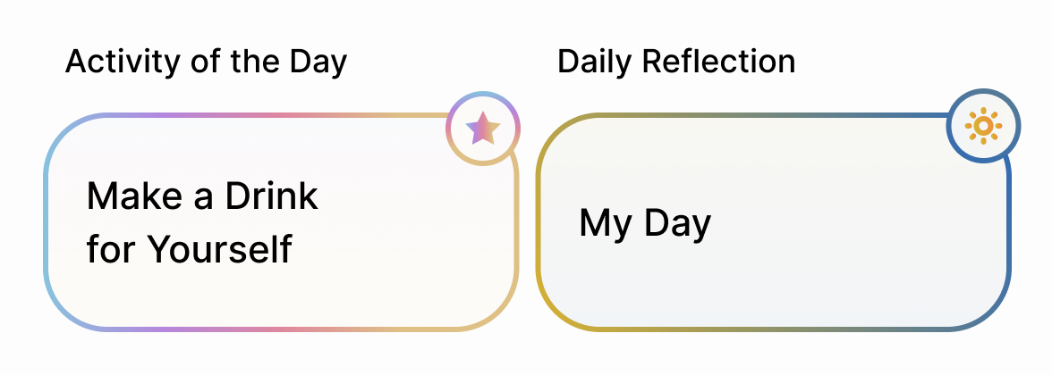
Once you cut something that no longer makes sense, it feels liberating. And that’s how I felt that day. (Also because I don’t have to come with activity ideas every week anymore 🤣)
Anyways, seeing how removal makes the app way simpler and cleaner altered my mindset that day. Not being attached to your creations and being flexible with adapting the product is an important skill. And it is a muscle every founder should build.
I finally asked to remove the streak bubble row.
A few weeks later
This time, we went further. We didn’t just cut a feature. We cut an entire tab. And not just any tab. The Home tab.
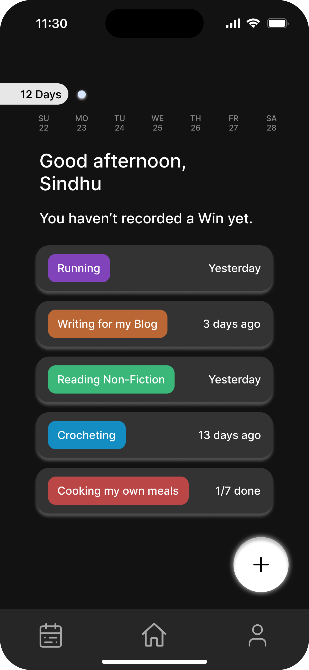
The Home tab was the first screen I ever designed for Snowball.
 |
_(10).png) |
|---|---|
| The very first mockup of the home tab (used to be known as the Action Hub) | The last version of the home tab (before we killed it) |
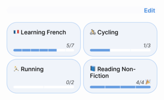
The home tab was supposed to be your dashboard: all the things you wanted to do, your progress, your weekly targets, all in one place.
And I wanted the option to add weekly targets to activities because I believed it gave people a reason to log on snowball so they ‘hit their goals’. I thought it was a powerful feature for retention. It all made sense in my head.
But the whole “weekly target” idea pushed Snowball closer to being a productivity app. That was the vibe I was trying to go away from. It made us feel like we were competing with a habit tracker, when actually, our mission is to be a fun, social app for hobbies and all the things you do in your free time.
Having weekly targets meant you had to log even if you had nothing you wanted to share specifically so it hit the ‘goal’ and that was starting to feel like a chore.
Also, the way the home tab was designed made it harder to do the most important thing: log an activity.
Adding this to the onboarding was one of the things we tried to teach users how to log,
We tried everything. Tooltips, demo logs, longer onboarding flows… but it just cluttered the experience.
The final trigger was when Aung, our new UI/UX intern, suggested a separate tab to log and asked me “Do we really need the home tab?”
Oof. I didn’t have a clear answer.
I had to make a decision.
New update
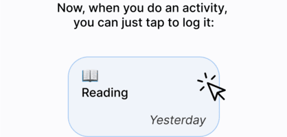
So after sleeping on it and pacing an empty meeting room for at least 27 times, I returned to our table the next day and gave the green light to remove the Home tab. Now the app opens straight into the feed, which positions Snowball to align with our core mission: social media for hobbies.
And logging has its own dedicated tab, right in the center. Clean and simple.

You can’t possibly not know how to log after this update (I hope).
Conclusion
Overall, cutting the very screen Snowball started from was scary. But once again, it felt liberating.
Removing features feels like chipping away at a statue. A necessary step for the product to take shape. With every update, I hope we chip away at the clutter and it becomes clearer what Snowball aims to be: A place to share what you do and seeing it all in one place. That’s all.
Now go update to the latest version if you haven’t yet :)
P.S. I do think there is benefit to being able to set targets/goals to activities but I don’t think it should be front and centre of the app (like how it was). We are still collecting feedback on how we can fit goals in (maybe being able to set reminders?). So, do email us via team@snowball.day to share your thoughts anytime.